
We just gave this website — and the Care Hub customer portal behind it — a full visual redesign. Same pages, same features, same one-call support. It just looks and feels a lot more like the polished, professional experience you'd expect from a technology company.
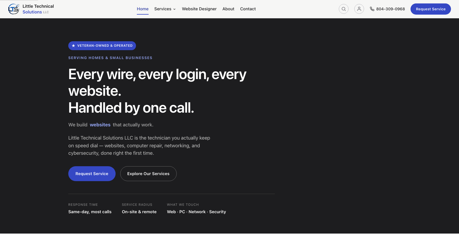
What actually changed
Every page got cleaner typography, more breathing room, and a simpler color palette built around a single confident accent color instead of competing colors pulling attention in different directions. Buttons, cards, and forms all follow one consistent style now, instead of small inconsistencies page to page.
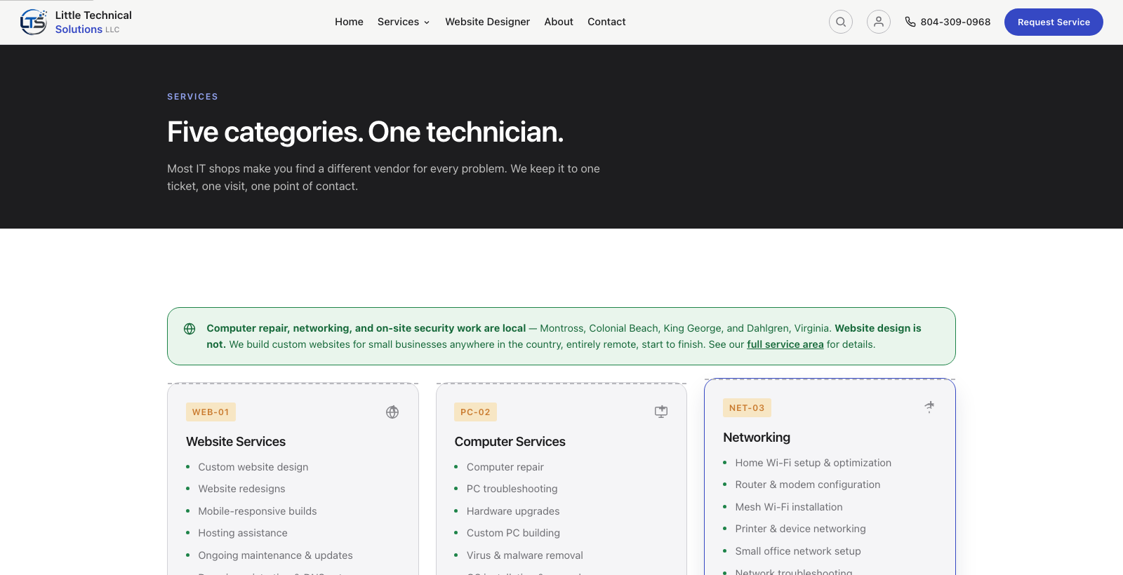
Why it matters to you
If you're a prospective customer sizing us up against other options, first impressions matter — a site that looks cared-for is a small but real signal about how we'll handle your project. If you're already a customer, this same redesign carries through the Care Hub portal you sign in to for invoices, service records, and messages, so your account doesn't feel like a bolted-on afterthought to the marketing site. One consistent look, one consistent product.
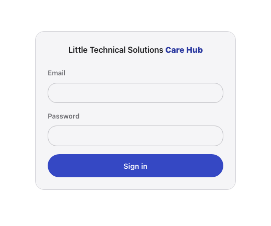
Nothing else changed
This was a visual pass, not a rebuild — every page, form, and feature works exactly the way it did before. If you spot anything that looks off or broken, let us know and we'll get it sorted out.